
Design Artifacts
Storyboards
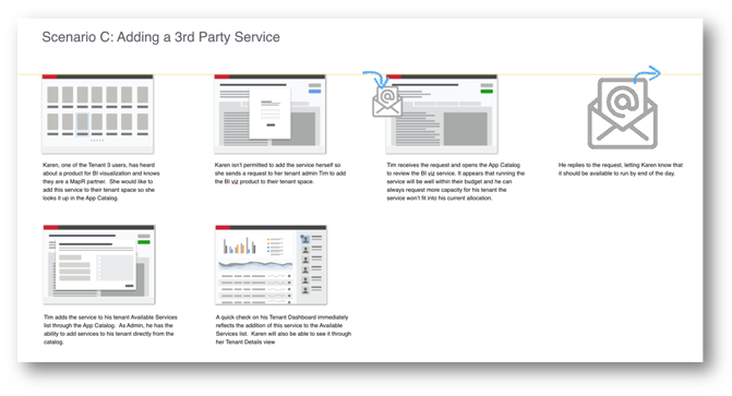
Once the key workflows have been defined, creating thumbnails to use in storyboards of those flows is an incredibly valuable tool for getting customer feedback before any greater effort is put into the designs.
This storyboard is about adding a new service to a tenant workspace.
Lo-fi wireframes
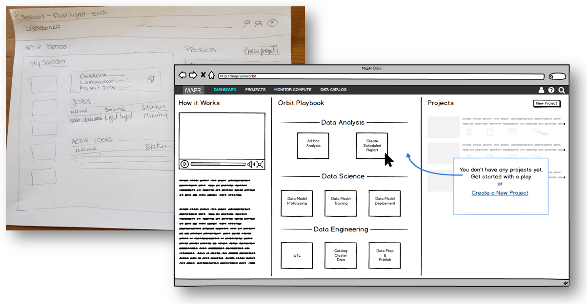
Lo-fi wireframes are also a great way to get feedback that is untainted by the effect of polished wireframes that tend to distract reviewers with color, labels, component placement, etc.
This mockup is for a task based dashboard for a product that facilitates data analysis, modeling, and data management.
Hi-fi wireframes
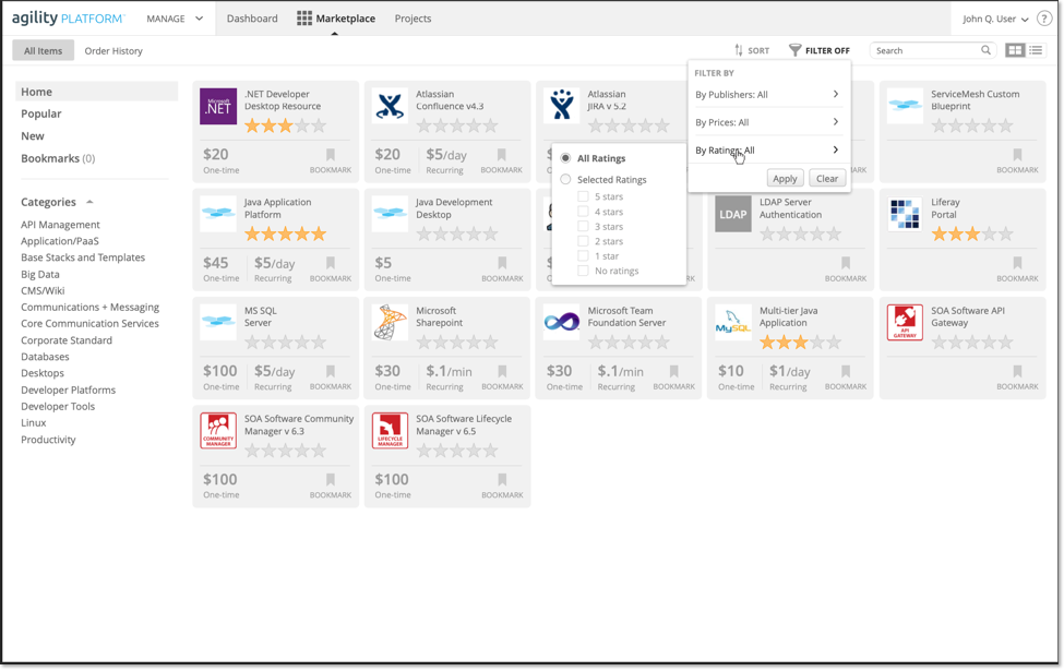
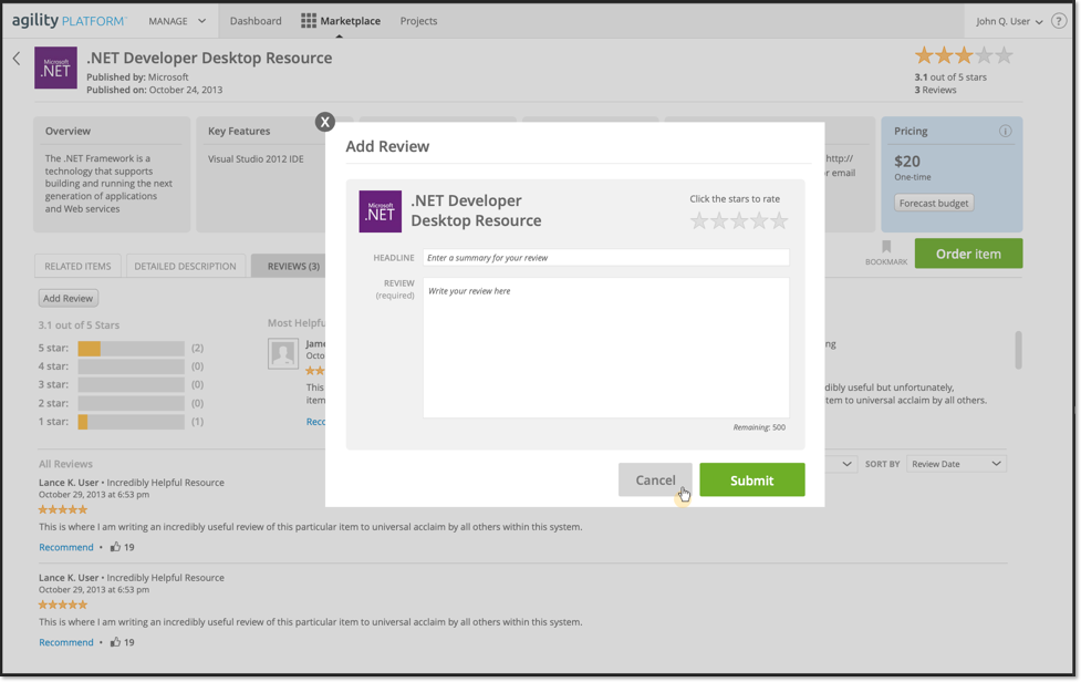
This type of wireframe can be handed off to a visual designer as a basis for styling and to development as a reference, especially when fully annotated by behavior and content requirements. They are also an excellent base for prototypes which give a sense of how the final flow will feel without creating an actual coded prototype.
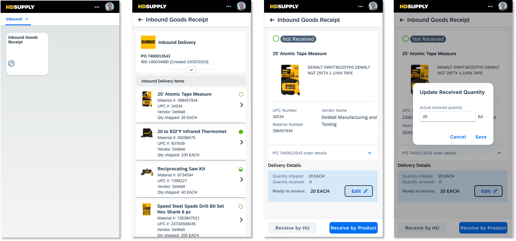
This first set is for a platform marketplace where users can buy pre-configured VM templates. The last image is screens from a SAP Fiori mobile app for receiving warehouse goods.
Hi-fi to visual design
The first image is the wireframe for a marketing campaign reallocation wizard. You can see the annotation callouts which are paired with requirements in the larger view. This gets handed off to the visual designer and eventually to the developers who will pair these requirements with the visual design view.
The lower image is the end result of a visual designer applying the set of styles to this wireframe. The is a collaborative effort to make sure the intent of the wireframe content is not lost in translation.
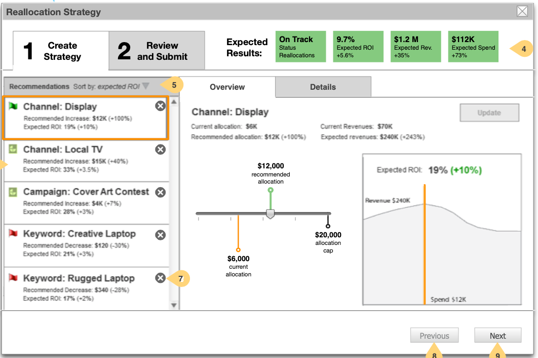
Wireframe of fund re-allocation wizard for a marketing campaign
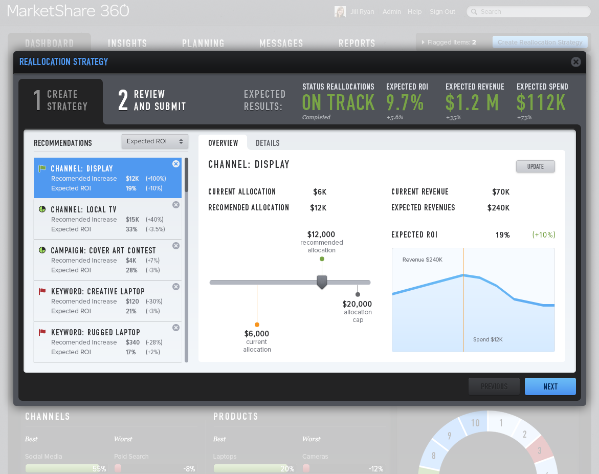
Final visual design for the above wireframe. Visual design not done by me.
Some interesting visualization solutions
Here are two designs I worked on that solve some problematic issues visually.
The first is a journey map for a security analyst based on many hours of research watching analysts do their thing. It tracks every step they take in their investigation and allows them to annotate the step nodes when they find something interesting. This can then be exported in the form of a story or case they can edit for their analysis conclusions. It also allows them to “show the work” to be able to reproduce their investigation exactly.
The second design rolls together the output of a lot of different tools into one easily viewed answer for “what all is happening on this host at this point in time, just before, and just after?” This information normally takes significantly longer for an analyst to extract but is key to understanding what went sideways when a host was attacked.
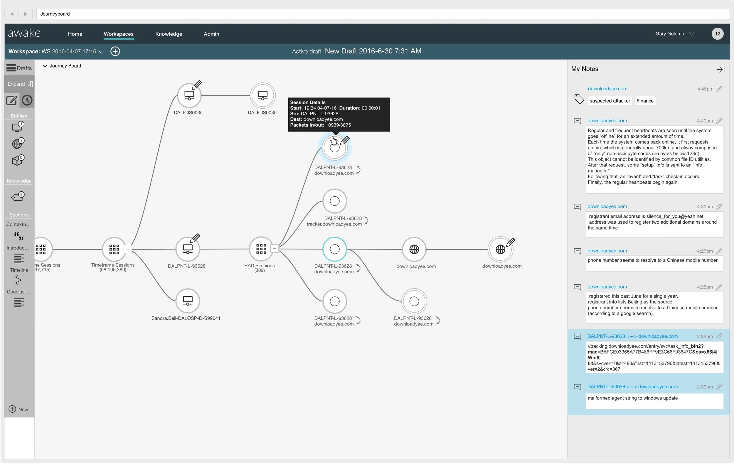
A live visualization of a security analyst’s investigation journey. This map collapses to a thumbnail bar at the bottom when not being viewed.
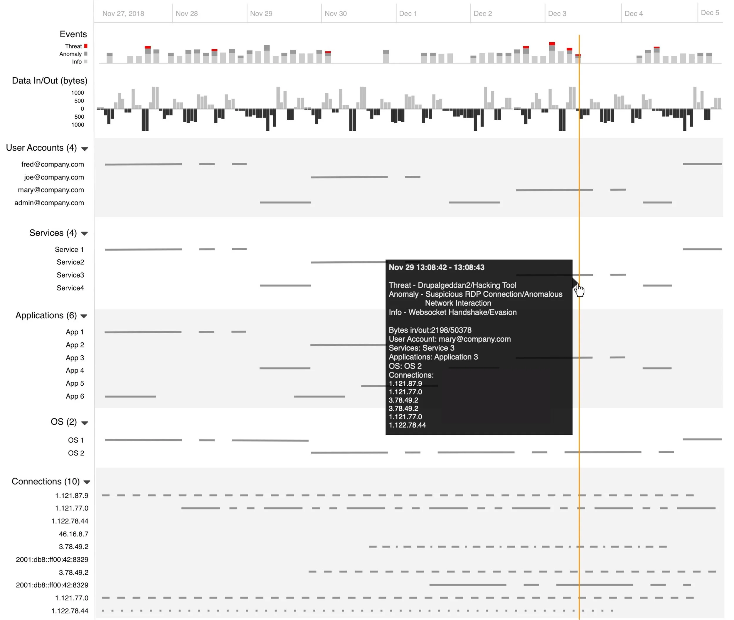
At-a-glance slice of all network and host activity over time on a single host.